 |
| Colouring a water splash |

Showing posts with label water. Show all posts
Showing posts with label water. Show all posts
Thursday, 8 January 2015
Tutorial: water splash
Obviously a cartoony style for this tutorial but hopefully people are interpreting the instructions in unique ways to get a desired result. Colouring a water splash! I really like this one.


Sunday, 9 March 2014
Tutorial: Colouring Ocean water elements part 3/4
Here is another tutorial on one of the 4 elements I did for Copicmarker.com. The Element here is water, and I decided to do the ocean since it was one I haven't seen done in a tutorial before.
Click on the image to go visit the tutorial.
 |
| Plesiosaur leaping in the choppy sea. |
Thursday, 21 October 2010
Tutorial - WaterDrops
So, Water Drops! I decided it's a nice simple tutorial to do! Waterdrops are really cool, and can be a really neat 3D effect as well. To start off you need to know what a water drop looks like. I took some photos.


This water drop I just put a drop of water on a post it note and using the Macro feature on my Camera I took a couple angled close ups. You can see that a water drop casts a shadow on the far side, and inside the drop there is a heavy glowing on one side, and darker on the other. these the reflection of my light bulb.
The first picture is the one I used in my samples with a few changes. What you have to decide first is what colour you want. I choose pink because well... I like pink, plus my Mums fighting breast cancer right now so its relevant.
Step 1
lay down a layer of your base colour.
 |
| I used RV10, but you can do this with ANY colour, even multiple colours. |
Make sure this layer dries fully or you'll have impatient marker syndrome (feathering)
Step 2
Step 2 I actually didn't Photograph. That was to ink the drop with a circle shape but not closing the circle. leave the bottom part open.

Hopefully you can see the inked area in my image.
The area I left un-inked is going to be the brightest area of the drop. Then I added a darker shade of Violet - V95 to be exact. something greyed out from your original colour. I went around the inside, leaving the area of the light area free, and also did the outside area opposite the light area, for the cast shadow.
Step 3
Blend it Quick!

So you can see how I've blended it soft on the inside, but NOT the cast shadow. I think the cast shadow should remain a hard edged. It's up to you. Develop your own style.
Step 4
 |
| This one has Pink lines - thought I'd Show as an example if line colour, but I didn't like it fully closed line like that. |
 |
| Using the blender to lighten the glow area. |
Now you want to take some colourless blender and lighten up that glow area inside the drop.
Push IN towards the centre of the glow to make it go away from your cast shadow area. Blend soft!
Step 5
Add White

Add a few drops of Opaque white, and by golly, you have a water drop.
I know my reference has only one light spot but 3's make better design company, so 3 dots is good for me.
Up close these look less effective, but look at this photo of them on my desk:
 |
| Click to embiggen |
When you see them in the photo they look pretty 3D eh? Especially the one closest to the left, that's the one inked in pink.


Heres a couple other drops, just for fun, since I was experimenting. the blue one is just a side view drop, and the grey one is a drip with multiple light spots and reflected colours in it. I poorly defined the shape, but I think it looked kinda cool anyway.
Extra Tidbits:
- Try adding reflections into your drops for a unique way of showing something Like A breast cancer ribbon, a Christmas tree, or Christmas lights. It could be rather fun to experiment!
- Light passes THROUGH a water drop, so sometimes right along the edge of the drop you will have dark on the inside, an EXTERIOR glow within the drop shadow.
- Study real drops. If you want to do something light Christmas lights, hold lights up to a drop of water, take a photo and use it as a reference.
- Try covering your light source up with coloured transparent sheets and see what effects are achieved.
Okay, I hope that was useful, or at least interesting in some way. I just NEEDED to get my markers out and use them today.
Soon I'll do more tutorials thanks to Happy Crafter's wonderful suggestions and inspiration on my To do List page.
Later, gators.
Monday, 10 May 2010
Finding the colours in an image
One of the things I've found is more difficult for people to grasp when they're learning to use markers, is the layering of colours to achieve a certain look. A great example is Skin. Human skin is made up of every colour of the rainbow, and skin comes in as many different colours as there are copic markers. Many people will just default to the standard Earth Skin tones and leave it at that, but there are ways of having a richer experience with your markers.
Alcohol based markers (Copic, Tria, Promarker, touch etc) are all transparent colours. that means when you layer them you can "mix" the colours, and any colour layered on top will still show that main colour through the subsequent layers. See my Diagram:

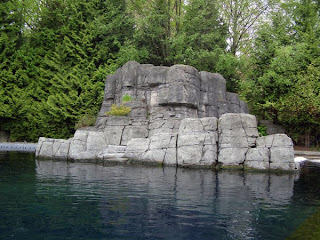 The Trees are Green, the rocks are grey, the waters blue...right? Sure they are. You could go in there with a set of greys, a few blues and a few greens and create a very respectable illustration. (As a side note, these rocks are in the Beluga exhibit at the Vancouver Aquarium, and they were the original inspiration behind the "look" of my film, Conflagration.) Lets take this one step further. Is it possible those rocks are Violet? The trees yellow? How about Red yellow and blue in all the elements of this image? You're probably having trouble seeing all these colours. That's understandable, they're hard to see. There is a quicky little trick to finding the colours you need to see in this image that you can do in photoshop.
 Y06
Y06
Lime Green (promarker)
Y21
R20
BV04
BV00
Lime green (promarker)
YG41
YG11
G21
BG93
G20 (To blend)
N3
CG4 (Touch markers)
B45 (in the background trees. see how it's a blue colour, but comes out as a dark green?)
B29
G99
G20 (to blend)
Copic Multiliner to enhance line art.
And then here is the finished product.
Hunting Rocks by `guruubii on deviantART
And that's really all there is to it :)
If you want to see a bit more of a realistic style, and using a skin tone, check out this video by Trev Murphy.
Alcohol based markers (Copic, Tria, Promarker, touch etc) are all transparent colours. that means when you layer them you can "mix" the colours, and any colour layered on top will still show that main colour through the subsequent layers. See my Diagram:

The red at 50% Opacity, overlapped with the blue at 50% opacity yielded a violet colour where they overlapped.
This is colour theory in very basic terms. You should realistically learn at least a little colour theory if you wish to be a successful artist. It's not that difficult, and even self taught artists (maybe especially?) should root themselves in some fundamentals from time to time.
Okay, so you can see how adding the blue over top of the red retained the properties of the red, thereby creating a new colour, but this is an extreme example.
You can use this technique subtly to create a more dynamic image.
Say for example, you're going to create a drawing of grey rocks. Heres a photo I took.
 The Trees are Green, the rocks are grey, the waters blue...right? Sure they are. You could go in there with a set of greys, a few blues and a few greens and create a very respectable illustration. (As a side note, these rocks are in the Beluga exhibit at the Vancouver Aquarium, and they were the original inspiration behind the "look" of my film, Conflagration.) Lets take this one step further. Is it possible those rocks are Violet? The trees yellow? How about Red yellow and blue in all the elements of this image? You're probably having trouble seeing all these colours. That's understandable, they're hard to see. There is a quicky little trick to finding the colours you need to see in this image that you can do in photoshop.
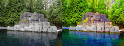
Open an image in photoshop that has the colours you want, or your reference image.
If you go to Image>adjustments> Hue/saturation you will get a dialogue box pop up with some bars to toggle the hue and saturation.
Take the saturation bar and push it up to 80% or so.
This is what you get.

See how it's made different colours appear? the edge of the tank on the far left is quite blue, the rocks are a nice mix of yellows and violets, the 2 bushes on the rocks are different - one's yellow and one's green - the water reflects all the colours in the entire image and beyond, and along the bottom of the rocks they are reflecting back some of the blue from the water.
How to apply that to markers? Well here is a little walk through of some stages of colouring of a drawing of these rocks.
Behold! all colours listed are Copic, unless specified

Lime Green (promarker)
Y21
R20
BV04
BV00
Lime green (promarker)
YG41
YG11
G21
BG93
G20 (To blend)
N3
CG4 (Touch markers)
B45 (in the background trees. see how it's a blue colour, but comes out as a dark green?)
B29
G99
G20 (to blend)
Copic Multiliner to enhance line art.
And then here is the finished product.
Hunting Rocks by `guruubii on deviantART
And that's really all there is to it :)
If you want to see a bit more of a realistic style, and using a skin tone, check out this video by Trev Murphy.
Subscribe to:
Posts (Atom)
