Alcohol based markers (Copic, Tria, Promarker, touch etc) are all transparent colours. that means when you layer them you can "mix" the colours, and any colour layered on top will still show that main colour through the subsequent layers. See my Diagram:
The red at 50% Opacity, overlapped with the blue at 50% opacity yielded a violet colour where they overlapped.
This is colour theory in very basic terms. You should realistically learn at least a little colour theory if you wish to be a successful artist. It's not that difficult, and even self taught artists (maybe especially?) should root themselves in some fundamentals from time to time.
Okay, so you can see how adding the blue over top of the red retained the properties of the red, thereby creating a new colour, but this is an extreme example.
You can use this technique subtly to create a more dynamic image.
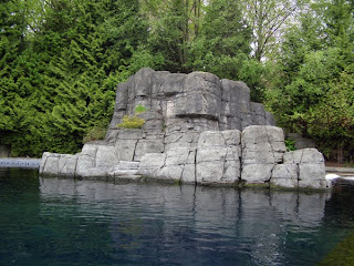
Say for example, you're going to create a drawing of grey rocks. Heres a photo I took.
 The Trees are Green, the rocks are grey, the waters blue...right? Sure they are. You could go in there with a set of greys, a few blues and a few greens and create a very respectable illustration. (As a side note, these rocks are in the Beluga exhibit at the Vancouver Aquarium, and they were the original inspiration behind the "look" of my film, Conflagration.) Lets take this one step further. Is it possible those rocks are Violet? The trees yellow? How about Red yellow and blue in all the elements of this image? You're probably having trouble seeing all these colours. That's understandable, they're hard to see. There is a quicky little trick to finding the colours you need to see in this image that you can do in photoshop.
Open an image in photoshop that has the colours you want, or your reference image.
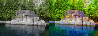
If you go to Image>adjustments> Hue/saturation you will get a dialogue box pop up with some bars to toggle the hue and saturation.
Take the saturation bar and push it up to 80% or so.
This is what you get.

See how it's made different colours appear? the edge of the tank on the far left is quite blue, the rocks are a nice mix of yellows and violets, the 2 bushes on the rocks are different - one's yellow and one's green - the water reflects all the colours in the entire image and beyond, and along the bottom of the rocks they are reflecting back some of the blue from the water.
How to apply that to markers? Well here is a little walk through of some stages of colouring of a drawing of these rocks.
Behold! all colours listed are Copic, unless specified
Y06Lime Green (promarker)
Y21
R20
BV04
BV00
Lime green (promarker)
YG41
YG11
G21
BG93
G20 (To blend)
N3
CG4 (Touch markers)
B45 (in the background trees. see how it's a blue colour, but comes out as a dark green?)
B29
G99
G20 (to blend)
Copic Multiliner to enhance line art.
And then here is the finished product.
Hunting Rocks by `guruubii on deviantART
And that's really all there is to it :)
If you want to see a bit more of a realistic style, and using a skin tone, check out this video by Trev Murphy.


wow, thats an awesome tutorial.
ReplyDeleteJepi learned something :>
yay, jepi learnded :>
ReplyDeleteExcellent work! I am TERRIBLE at markers. Absolutely horrible. I fear I am going to mess up and lose a nice piece of artwork D:. I shall try harder with this walkthrough having boosted my spirits.
ReplyDelete- Ale-Xander
If there's anything you want me to cover in my blog, you let me know :)
ReplyDeleteI'm running out of ideas HA!