
Showing posts with label swatchbook. Show all posts
Showing posts with label swatchbook. Show all posts
Sunday, 9 March 2014
Resources: Skintone Swatches
I've recently compiled a little swatch collection of Skin tones. I've made an image with all the swatches from lightest to darkest. I'll add to this image when I have new swatches I can include on it so this will be a growing resource. I hope it's useful


Monday, 13 December 2010
Decoding Copic Markers
Every time I want to talk about the way Copic labels it's colours, and how to interpret it, I forget where I learned it to link it!! Well, Nevermore! I'm going to put it all right here! I am sorry for the blog flood today though! trying to catch up! HAHA!
Decoding Copic Markers
The numbers and letters on the copic cap's actually serve a great purpose.
The letters are fairly simple to discern:
B=Blue, BG=Blue Green, BV=Blue Violet, G=Green,YG=Yellow Green, Y=Yellow, YR=Yellow Red, R=Red, RV=Red Violet, V=Violet, E=Earth, C=Cool Gray, N=Neutral Gray, T=Toner Gray, W=Warm Gray
The numbers can be a little bit tricky. All the markers follow the same principle except Earth colours (E).
Every Copic Rep, blogger, and artists I've ever met or spoke to has said this, but no one has decoded the earth's for me. All I can tell you about earth colours is that they have blending groups, and they're yummy.
Behind the letters of the code, there are 2 numbers the first number is the colours Saturation - in other words, how pure and bright the colour is. Or put differently; how much grey is in it. Example: BG05 would be a very vibrant bright, clear colour as it has no grey in it, while BG93 is a very dull and greyed colour because it's got the highest concentration of grey in it; it is in fact called Green Grey.
Now the second number shows how dark or light a colour is. So BG00 is a very light colour, it's nearly white, while BG09 is quite a dark colour, but the purity of colour is still there.
Now you know that information, How do you use it?
Well, you can easier find blending groups by paying attention to these codes, and also you'll easily find colours that will feather blend together.
Blending groups generally have the same numbers as a first number, and the second letter moves higher or lower.
EG: BG93, BG96, and BG99
This is a blending group! Of course you always must experiment but having the Copic swatch book handy, takes all the hunting and guess work out of it (especially for those pesky E's)!
I'll be using this information a little more in my copic class in February too!
Sunday, 27 June 2010
Planning an Illustration
So, With my most recent illustration I posted here I was tackling things I've never done with markers before.
I've done a few little sketch cards with a secondary light source, blue glows etc, but nothing on a larger scale. I also never coloured thunderstorms before. So instead of blindly throwing markers to paper and hoping for the best, I did a little pre planning.
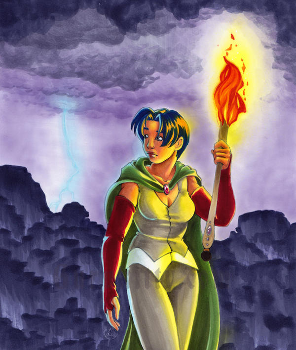
Step one for your illustration is research. I googled thunder storms, and lightning for hours before I did this. As I sketched, I'd take breaks to google, and see what sort of sky's came from lightning. In the end I wanted a nice violet sky, since I think I under use violets (hyuk hyuk... I use it in EVERY picture in some form), and it had the most appeal for me. I also searched around for fire, and looked at how fire light casts on skin etc. I made sure to give her skin a nice red brown tone to it, and the torch would be shadowed below her hand etc.
This research is even more important than the anatomy, or any other accuracy. These little details are what make your images believable.
 My sketch had the basic shading blocked in. This helps. I knew the torch would be the dominant light source, and the lighting would be to secondary light source.
So... my shading is pretty rough here too, but it was partially in my head as well. As you can see I also have notes about the colours I wanted the sky.
I also played around with the design of the fire. As an illustrator, you should take some time making sure your elements are somewhat stylized in some way. No, it doesn't look like real fire, but wouldn't that look silly with my cartoon woman?
My biggest pet peeve in the cartoon world is a huge beginner plague of throwing characters over top of a photo BG. That makes no sense to me.
Your environment should compliment your characters!
 Anyways, so after I had an idea of what I wanted, I needed to think about what colours I was going to use. It's always best to test colours and techniques on the same type of paper as your illustration! In this case I used Copic Pure white, and tested on a test page from my reference book.
The cliffs (yes, those are indeed cliffs. I know, epic fail at them but... I tried something new. Sue me) were initially going to be silhouetted but I couldn't stomach using black, and I didn't have any colours close to black, except one I made, that was a red black. Red would not have been fitting here. I had to make a new colour. I made one out of 10 parts BV04 and 1 part 100 (seen in the bottom of this testing page. I tried various ratios. I'll do a little article on mixing colours someday). This mix gave me a near black violet colour I really liked.
I also wanted do do some fantasy style cliffs, and tested the technique (bottom left corner) and thought it looked good. looked better smaller, that's for sure, LOL.
...Anyways, So ya, the other thing I wanted to pre-plan was the lighting from the torch, and to make sure that what was in my head could make it onto paper realistically. SO you see there, I inked 2 quick faces, and coloured them in a couple different ways. I discussed some of it with my sister as well and we decided that the skin and hair needed to have different yellows used to create the light on her. Y11 for her skin and Y17 for her hair.
I wrote down all the colours I used, in the order i used them. so when it came to making it onto paper i had no surprises.
I also made some tests of the blue lightning on the dark sky. Light colours push dark colours, but they all do it differently. I was testing which one would do it best.
So there you go, the wee bits of research that went into my illustration.
Hope someone finds this useful :)
Remember, Research is your friend.
I've done a few little sketch cards with a secondary light source, blue glows etc, but nothing on a larger scale. I also never coloured thunderstorms before. So instead of blindly throwing markers to paper and hoping for the best, I did a little pre planning.
Step one for your illustration is research. I googled thunder storms, and lightning for hours before I did this. As I sketched, I'd take breaks to google, and see what sort of sky's came from lightning. In the end I wanted a nice violet sky, since I think I under use violets (hyuk hyuk... I use it in EVERY picture in some form), and it had the most appeal for me. I also searched around for fire, and looked at how fire light casts on skin etc. I made sure to give her skin a nice red brown tone to it, and the torch would be shadowed below her hand etc.
This research is even more important than the anatomy, or any other accuracy. These little details are what make your images believable.

So... my shading is pretty rough here too, but it was partially in my head as well. As you can see I also have notes about the colours I wanted the sky.
I also played around with the design of the fire. As an illustrator, you should take some time making sure your elements are somewhat stylized in some way. No, it doesn't look like real fire, but wouldn't that look silly with my cartoon woman?
My biggest pet peeve in the cartoon world is a huge beginner plague of throwing characters over top of a photo BG. That makes no sense to me.
Your environment should compliment your characters!

The cliffs (yes, those are indeed cliffs. I know, epic fail at them but... I tried something new. Sue me) were initially going to be silhouetted but I couldn't stomach using black, and I didn't have any colours close to black, except one I made, that was a red black. Red would not have been fitting here. I had to make a new colour. I made one out of 10 parts BV04 and 1 part 100 (seen in the bottom of this testing page. I tried various ratios. I'll do a little article on mixing colours someday). This mix gave me a near black violet colour I really liked.
I also wanted do do some fantasy style cliffs, and tested the technique (bottom left corner) and thought it looked good. looked better smaller, that's for sure, LOL.
...Anyways, So ya, the other thing I wanted to pre-plan was the lighting from the torch, and to make sure that what was in my head could make it onto paper realistically. SO you see there, I inked 2 quick faces, and coloured them in a couple different ways. I discussed some of it with my sister as well and we decided that the skin and hair needed to have different yellows used to create the light on her. Y11 for her skin and Y17 for her hair.
I wrote down all the colours I used, in the order i used them. so when it came to making it onto paper i had no surprises.
I also made some tests of the blue lightning on the dark sky. Light colours push dark colours, but they all do it differently. I was testing which one would do it best.
So there you go, the wee bits of research that went into my illustration.
Hope someone finds this useful :)
Remember, Research is your friend.
Sunday, 6 June 2010
Paper Comparison
At the Copic Certification workshop I received a small packet of paper samples obviously geared toward card makers and paper crafters, but it did give me some neat samples to play with and see what sort of techniques could be achieved from some different types of paper. I did a quick ink drawing on each one, and tested with Copics.
I didn't test my own favourite paper, Aquabee Bleedproof marker paper, but I did test 5 others: Neenah card stock, Vellum, Glossy photo paper, Copic Illustration paper and Couture card stock. I'll go over one by one going over Transparency (for transferring image via light box), Inking, colouring solid colours, blending colours, correcting mistakes with blender, airbrush, and blender effects. For the blender effects, I used a piece of terry cloth. For all the inking I used 0.1 black copic multiliner, and the colours I used were E11, E13, E15 and E27 for the most part and B21 for the airbrush.
Vellum

Vellum is a really transparent light almost like parchment paper. It's a drafting and design paper. you can do many things with it.
Inking: The vellum had a little tooth, but the ink was clean and crisp, and didn't smudge with the application of markers over top.
Transparency: Very transparent - could easily see the sketch below even without the light box.
Colouring: On the front side, colouring was not smooth easily, and the ink seemed to just sit on top, but when coloured from the back (as seen on the brown wing) the colouring was very smooth. I used a dabbing technique to try to add some shading to it, but the ink sat in blobs, HA. When the base colour is applied to the front, and a shade colour is done on the back, you can achieve a nice cel-shaded look without budging your base colour.
When the ink was laid down it seems to pool and puddle and could achieve a very nice watercolour effect.
Blending: Blending is nearly non existent in the sense that I need to do it. again the colouring front and back helps to achieve this. As a side note, the colours were very light when applied to this paper.
Correcting with blending: It doesn't seem to work to try to correct the mistakes on this particular vellum, but I know some of the more "plastic" vellums leave the markers completely removable.
Airbrush: The paper took the airbrush well, but pooled quickly when trying to go over an area a few times without letting it first dry.
Blender effects: I was surprised with so many failed attempts to correct the mistakes with the blender, that the blender effects were so bold! (see on the back of her head, wing area).
Glossy Photo Paper
 The glossy paper Is a fairly heavy slick shiny paper.
Inking: Ink goes on crisp and clear and smoothly on this paper. There is a slight drag to the pen. The inking is smudged away with the application of the marker.
Transparency: It was adequate to see through with the light, surprisingly.
Colouring: Laying down a smooth coat seemed tricky. it doesn't soak into the paper, but it doesn't quite sit on top either. the result was blotchy and not very desirable.
Blending: completely non existent. the previous dried layers are unaffected by further applications of colour, so there is no blending to be had. the colour sits on top if dabbed on, so you can achieve a watercolour effects.
Airbrush: The paper took the airbrush very soft and smooth, unless it took some saturation, then it pooled and sort of, pushed it away.
Fixing mistakes with blender: Very minimal effect...
Blender effects: No effect.
This paper is ideal for making textures, and faux stone techniques with the various Inks and felts etc. these can be used as a backdrop for images.
Neenah Card stock
 Neenah card stock is the one that most of the blogs that I've read talk about as the end all be all of paper for Copics; for cards that is... Illustration is a whole different beast.
Inking: good inking. I noticed a bit of softening of the lines when I went slower but it really is about on par with the Copic and Aquabee paper I enjoy.
Transparency: Good, Easy to see through with the light.
Colouring: It seems to take a pretty heavy saturation of ink before getting a smooth coat of colour on it. The colours come out a bit darker than I am used to from the other papers too. It's a fairly absorbent card stock, a few steps below Bristol board in that regard.
I found it tended to feather out quite quickly with repeated application of colour. I can see why the card makers love it, given that they do 2-3 light layers of colour, but for an illustrator layering up to 20 layers (or more) the feathering can be problematic. I didn't find it terribly difficult to work around though.
Correcting with blender: Mistakes are corrected very cleanly and easily on this paper!
Blending: Blending was very easy, and clean and I quite enjoyed it! It is exceptional!
Airbrush: The airbrush was excepted extremely well, and looked really good! I loved the airbrush on this!
Blender effects: this paper is perfect for the blender effects, you can really get a fine texture with ease!
Couture Card stock
 Couture is a new one to me, I never heard of it before I got this sample. Its a very smooth card stock.
Inking: The inking was wonderful, very smooth feeling of the nib over this paper, and the ink looked great.
Transparency: On par with the Aquabee paper. Very good and clear.
Colouring. The colours come out quite light, and seems to dry almost instantly, but you can still get an even coat of colour relatively easy, and with less saturation than the Neenah.
Blending: Blending is fairly easy, and neat. Very nice!
Correcting with blender: Easy, neat and clean. wouldn't know I made a mistake!
Airbrush: This paper took the airbrush the best of all the papers I've used. incredibly smooth!
Blender effects: Took the effects really well, and easily.
Copic 80lb pure white Illustration paper
 My favourite of the day, it's the heavier of the marker papers produced by Copic, so it's no surprise their paper works well with their markers. the paper is medium weight, opaque and smooth.
Inking: Great, on par with all the other great card stocks. Ink didn't budge when I took markers to them.
transparency: On par with the others. very good, easy to see through.
Colouring: A dream. takes a very light saturation to get an even smooth coat of colour. the colours are fairly true to the Aquabee paper I use, which is good for me. Minimal feathering!
Blending: a Dream! it's almost effortless to blend on this paper.
correcting with blender: also great. the Neenah (and Aquabee) still reign supreme on this feature though
Airbrush: this is my favourite next to the couture, it's clear and smooth. It didn't pool at all, and I even tried to make it do it, HA.
Blender effects: Brilliant, came out wonderfully neat and clean!
SO overall my favourite was the Copic Paper, followed by couture and then Neenah. they all had qualities I liked though. If I could combine those 3 I would. I still think I'll be sticking to my Aquabee for now (available through Opus framing and art), but when that runs out I might toss in some Copic ;) And these little drawings with my notes all over will make it into my swatch book for future reference.
I didn't test my own favourite paper, Aquabee Bleedproof marker paper, but I did test 5 others: Neenah card stock, Vellum, Glossy photo paper, Copic Illustration paper and Couture card stock. I'll go over one by one going over Transparency (for transferring image via light box), Inking, colouring solid colours, blending colours, correcting mistakes with blender, airbrush, and blender effects. For the blender effects, I used a piece of terry cloth. For all the inking I used 0.1 black copic multiliner, and the colours I used were E11, E13, E15 and E27 for the most part and B21 for the airbrush.
Vellum

Vellum is a really transparent light almost like parchment paper. It's a drafting and design paper. you can do many things with it.
Inking: The vellum had a little tooth, but the ink was clean and crisp, and didn't smudge with the application of markers over top.
Transparency: Very transparent - could easily see the sketch below even without the light box.
Colouring: On the front side, colouring was not smooth easily, and the ink seemed to just sit on top, but when coloured from the back (as seen on the brown wing) the colouring was very smooth. I used a dabbing technique to try to add some shading to it, but the ink sat in blobs, HA. When the base colour is applied to the front, and a shade colour is done on the back, you can achieve a nice cel-shaded look without budging your base colour.
When the ink was laid down it seems to pool and puddle and could achieve a very nice watercolour effect.
Blending: Blending is nearly non existent in the sense that I need to do it. again the colouring front and back helps to achieve this. As a side note, the colours were very light when applied to this paper.
Correcting with blending: It doesn't seem to work to try to correct the mistakes on this particular vellum, but I know some of the more "plastic" vellums leave the markers completely removable.
Airbrush: The paper took the airbrush well, but pooled quickly when trying to go over an area a few times without letting it first dry.
Blender effects: I was surprised with so many failed attempts to correct the mistakes with the blender, that the blender effects were so bold! (see on the back of her head, wing area).
Glossy Photo Paper

Inking: Ink goes on crisp and clear and smoothly on this paper. There is a slight drag to the pen. The inking is smudged away with the application of the marker.
Transparency: It was adequate to see through with the light, surprisingly.
Colouring: Laying down a smooth coat seemed tricky. it doesn't soak into the paper, but it doesn't quite sit on top either. the result was blotchy and not very desirable.
Blending: completely non existent. the previous dried layers are unaffected by further applications of colour, so there is no blending to be had. the colour sits on top if dabbed on, so you can achieve a watercolour effects.
Airbrush: The paper took the airbrush very soft and smooth, unless it took some saturation, then it pooled and sort of, pushed it away.
Fixing mistakes with blender: Very minimal effect...
Blender effects: No effect.
This paper is ideal for making textures, and faux stone techniques with the various Inks and felts etc. these can be used as a backdrop for images.
Neenah Card stock

Inking: good inking. I noticed a bit of softening of the lines when I went slower but it really is about on par with the Copic and Aquabee paper I enjoy.
Transparency: Good, Easy to see through with the light.
Colouring: It seems to take a pretty heavy saturation of ink before getting a smooth coat of colour on it. The colours come out a bit darker than I am used to from the other papers too. It's a fairly absorbent card stock, a few steps below Bristol board in that regard.
I found it tended to feather out quite quickly with repeated application of colour. I can see why the card makers love it, given that they do 2-3 light layers of colour, but for an illustrator layering up to 20 layers (or more) the feathering can be problematic. I didn't find it terribly difficult to work around though.
Correcting with blender: Mistakes are corrected very cleanly and easily on this paper!
Blending: Blending was very easy, and clean and I quite enjoyed it! It is exceptional!
Airbrush: The airbrush was excepted extremely well, and looked really good! I loved the airbrush on this!
Blender effects: this paper is perfect for the blender effects, you can really get a fine texture with ease!
Couture Card stock

Inking: The inking was wonderful, very smooth feeling of the nib over this paper, and the ink looked great.
Transparency: On par with the Aquabee paper. Very good and clear.
Colouring. The colours come out quite light, and seems to dry almost instantly, but you can still get an even coat of colour relatively easy, and with less saturation than the Neenah.
Blending: Blending is fairly easy, and neat. Very nice!
Correcting with blender: Easy, neat and clean. wouldn't know I made a mistake!
Airbrush: This paper took the airbrush the best of all the papers I've used. incredibly smooth!
Blender effects: Took the effects really well, and easily.
Copic 80lb pure white Illustration paper

Inking: Great, on par with all the other great card stocks. Ink didn't budge when I took markers to them.
transparency: On par with the others. very good, easy to see through.
Colouring: A dream. takes a very light saturation to get an even smooth coat of colour. the colours are fairly true to the Aquabee paper I use, which is good for me. Minimal feathering!
Blending: a Dream! it's almost effortless to blend on this paper.
correcting with blender: also great. the Neenah (and Aquabee) still reign supreme on this feature though
Airbrush: this is my favourite next to the couture, it's clear and smooth. It didn't pool at all, and I even tried to make it do it, HA.
Blender effects: Brilliant, came out wonderfully neat and clean!
SO overall my favourite was the Copic Paper, followed by couture and then Neenah. they all had qualities I liked though. If I could combine those 3 I would. I still think I'll be sticking to my Aquabee for now (available through Opus framing and art), but when that runs out I might toss in some Copic ;) And these little drawings with my notes all over will make it into my swatch book for future reference.
Blender Textures
So, something I finally saw in action at the Copic Certification is colourless blender textures. When I first read about it, the images didn't do it justice. I really couldn't figure out the benefits, so I never really played around with it too much. Then In the Copic course I had a chance to see it in action and try it myself, and now I'm addicted. I used it recently on the rock walls in this drawing. Its a nice subtle textured effect.
So I started grabbing everything in sight to see what sort of textures I could get and I made a sheet for my reference book.
How its done: I took a Copic wide marker and made these swatches of blue, but if you were doing an illustration, you'd do the colouring of your section first (and before you colour the rest of the image). You put colourless blender solution in a spray bottle (preferably something that does a fine mist. you can get them from a craft store), and mist it on the texture, then you press that texture onto your coloured area. be gentle. Let the blender dry before really judging the technique. Test it on swatches with different techniques.
Here is mine:

So I started grabbing everything in sight to see what sort of textures I could get and I made a sheet for my reference book.
How its done: I took a Copic wide marker and made these swatches of blue, but if you were doing an illustration, you'd do the colouring of your section first (and before you colour the rest of the image). You put colourless blender solution in a spray bottle (preferably something that does a fine mist. you can get them from a craft store), and mist it on the texture, then you press that texture onto your coloured area. be gentle. Let the blender dry before really judging the technique. Test it on swatches with different techniques.
Here is mine:

Monday, 31 May 2010
reference book 2
So after my Copic Certification course, I came home with 2 pages of swatches, tests, and tricks to translate into my resource book! Golly, what a task. Welcome to swatch Madness!


So this is how I've continued on my swatch book; I apologize for the quality of the images. Its a dark rainy day, with no light!
I thought first and foremost, I needed a page for my custom mixed colours. I've only got 2 so far (out of empty markers! waa!) But here's how I set this up.

I put a swatch with dagger strokes (Flicking strokes) on the side, and then labelled the colours and the ratios used to make these colours. The first colour is a really like colour I use often for skin shading. It works best as a middle or bottom layer as its so light it tends to push colours away.
The second colour is a red black I made. I rarely use true black, but sometimes I need almost black. My illustrations have fire in them sometimes and fire always looks best on a dark background, but I wanted a dark colour that had some heat to it. Red black, Viola!
So that's one of my new pages.
I already started converting some of the Feather blending tests into a page of good combinations :)

I know I mentioned I'd post bad combinations as well, but Right now I'm trying to preserve the good ones.
Now they had some more colours than I had at the workshop, so I had to make some swaps and exceptions for my swatches on this sheet. I'll save my crazy swatch madness as well, for the future when I get those colours.
Something I started working on before was some colour themes. I got a colour combo swatch sheet from Copic Creations, and made some little swatches of colour combinations I like. I know people like to stick within the blending families, but. you know, I don't! HA! I like to sometimes have dominant colours etc.
Anyway, so the first couple pages are of some colour combinations within colour groups

You see I have some yellows, and greens and earth colours. some of them are all the same value, and some of them have a dominant colour. They're just colour combinations I liked for some reason or another. I can refer to this if I need to when I'm illustrating.
These next swatches are colour themes:

See, they're not (mostly) within colour groups, but they're just colour combinations I thought looked good. Sometimes when I'm designing characters I have a hard time coming up with a colour theme for a character so I can flick through here and see a combination I like, like the pinks and greens, or orange and blue violets. Nice!
So there it is, That's as far as I've gotten... HAHA! working on more! Show me yours!
Next, I'll be doing a swatch page of effects I think :D
Monday, 12 April 2010
Reference Book
Every Marker blog I've looked at or follow says you should keep a swatch book or something along that vein. I never bothered but the more I read about it the more I think, that's a brilliant idea! no wonder so many people are doing it. But most of the blogs I follow are for stampers which has a different set of needs than the illustrator.
So I've started keeping a Reference book. I bought an inexpensive portfolio that can have pages added to it, since I really don't know the extent of what I'll be doing here, I wanted to make sure I'd always have room to expand with my needs. Now... where do you start? Well, I'll show how mine builds up over time, then we can learn this together.
So far my book starts like this:
After this I haven't got beyond printing a couple pages of things but I've got plans for pages.
Okay, so I'll make charts, and make them available to you here, and we'll get building!
remember these few things:
So I've started keeping a Reference book. I bought an inexpensive portfolio that can have pages added to it, since I really don't know the extent of what I'll be doing here, I wanted to make sure I'd always have room to expand with my needs. Now... where do you start? Well, I'll show how mine builds up over time, then we can learn this together.
So far my book starts like this:
- Page 1 is my printed out Copic Colour chart. ( PDF ). You can find this on the Copic Website Library. Print it out on the paper you will be working on. If you use multiple types of paper you might want to have multiple colour charts. I buy the 8.5x11 Aquabee Marker Paper just so I can put it through the printer easily without cutting, and I use the 11x17 sheets to cut to my desired sizes for art work.
- Page 2 I printed out the Copic Colour wheel (pdf). I find it fun to look at, but also it's a good reference to see where colours fall in the colour world. I just like it, okay?!
After this I haven't got beyond printing a couple pages of things but I've got plans for pages.
- Skin tones: I have several characters with different skin tones and I'd like to duplicate that skin tone easily from drawing to drawing without too much thought. I'm going to be making a swatch sheet for making up a skin tone guide for each character (anytime I make a swatch sheet I'll share it here on my blog)
- Colour Themes: My characters also have specific colour themes to them as well, I'd like to make a swatch page for their colour themes so I remain consistent.
- Lighting techniques: Different colour combinations to create different lighting. (This is where I wish I'd have the time to get some stamps made up for images to do the same image over and over! HA!)
- Colour groups: Interesting groups of colours that go well together that I've liked
- Blending groups: Groups of colours that blend well together
- Feather blending groups: this is trickier to explain. If you want to gradient from one colour to another the colours have to go well. I'd like to keep track of successful (and unsuccessful) attempts at this. What works, and what doesn't in other words.
- Paper types: I'd like to have swatches of different paper types, and what techniques work best on them.
- Brand Comparisons: Making sure I have swatches of my other brands to compare colours and see if they go well. Though I'm focused on Copics now because of the refillable quality and availability, i still have 300 markers in other brands I'd like to make good use of.
Okay, so I'll make charts, and make them available to you here, and we'll get building!
remember these few things:
- Markers are not light fast. Protect your swatches from light so they don't fade. my book is black and stowed away until I need it.
- Keep it organized. IT wont be any good to you if you cant find what you need in there.
- Print or draw your swatches on the paper you want to use, and mark what type of paper it is. Markers look different depending on the type of paper you use.
Okay, I'm going to work on this, and a Copic Airbrush walkthrough! Whoo!
Subscribe to:
Posts (Atom)
