 |
| Shiny Metal |

Showing posts with label art. Show all posts
Showing posts with label art. Show all posts
Tuesday, 6 January 2015
Tutorial: Shiny Armor
I did a series of Metal tutorials on Copicmarker.com. Here is the shiny armour tutorial colouring a new shiny silver breastplate.
Monday, 5 January 2015

Wednesday, 11 May 2011
Copic colouring
Kinda experimenting with some skin tones, and some accents....In reality I just wanted to colour Victor with his moustache. It gets a little hard on a person to be drawing cartoony stuff all the time, every now and then I want to bust out some drawings of my more....real characters. not that these guys are real looking at all...
 |
Side note, I'd like Aaron Ekhart to play Victor in a TV movie of Conflagration |
Mixing colours is awesome. This is my 5th colour I've mixed and recorded :)
Sunday, 27 February 2011
New Copic Colours
Oh! The last 2 days I spent entirely too much money on Copic Markers! I bought a pile of refills and colours I needed from Opus, then went to my Mums on Saturday looking for a new storage block for my new markers and the man at Country Lane crafts recognized me and said that he had the new 12 colours in stock behind the counter if I wanted to look! (of course!)
Me and another woman basically pillaged his pile, and he's probably completely out now, LOL!
They're wonderful colours!
Okay, I'm having an issue with my markers I've never experienced before, I'm wondering if anyone else has had this experience!
On my sketch markers some of them are lighter on one end than the other. as if the ink is settling on one side. The other side is still juicy but a more diluted colours like all the colourless part of the solution is gong to one end and all the dye is going to the other.

I've always stored my markers in the hard cases. I have them standing on end slightly leaned back. I'm convinced it's something I've done or else it wouldn't affect them so randomly, or the internet would have some discussion on it. I've googled my heart out and can't find anything.
I've contacted Copic and I'm just waiting on a reply. Crazy isn't it?! I can't figure it out! I've got the new swatch book now so I'm not sure if I should continue filling it out as I don't know if it's actually accurate colour I'm getting from my markers just now :P
Oh well, It's a little frustrating but I'm confident they'll come up with a solution over at Copic.
I'm going to be working on Wrapping up my Copic class today, as well as some Art Work.
Update: Yes it was fixed, and NO it was not the pressure in the marker. That's the first thing everyone said, but if it was that I wouldn't have posted, as it's the first thing you basically learn about markers... LOL.
Although not 100% sure of the cause, SHAKING the marker, then scribbling with the light end until it came to the right colour, or refilling the marker again fixed it.
Wednesday, 23 February 2011
Dealing with marker art work and a bit of a rant.
Scanning Marker art:
So I spend a lot of time adjusting my images once they're scanned to restore them to the original look because scanners do tend to kill some colour.
Whether you're scanning cards or illustrations the same type of problems can occur.
I just stumbled on this neat tutorial on dA and thought I'd share it with you. It follows the methods I mainly use to fix up my images.
Tutorial: My Scanner Hates Me by *Wolf-Suit on deviantART
Storing your Marker Art work:
Most everyone knows that dye based markers (all of them...) are not completely light fast. this isn't as detrimental as it sounds. No they're not light fast, but that doesn't mean they fade, and burst into flames like a (real) Vampire as soon as the light hits them. You can preserve your work with proper storage and care.
For storing my Marker Illustration I mainly use a variety of sizes of Itoya Profolio. The black paper and plastic sleeves are archival, and the book keeps the light out. There are a number of different items, these ones just happen to be available for me.
Key words you want to look for with storage products are Acid Free and Archival. I've previously created a blog post on that.
They Key is to keep them out of the light, and in an acid free environment.
There are varnishes on the market that are UV protecting. I've yet to try one on a marker drawing, but I hear they're available. I personally don't like the idea. I think if you need to do something like that, you're better off using a UV protecting class and a frame.
A little rant about blogs and misinformation:
Sometimes I google for information, and sometimes I come across something that really puts me off; Misinformation!
I do a great deal of research into what I post about in my blogs (all 5 of them) and I make sure my information is as accurate as possible by contacting the manufacturers and the reps for companies all the time.
(I seem to have a running contact with Copic LMAO). By doing this I'm getting my information from the source! Be very careful about how you speak about stuff in your blogs.
I came across one today that said "Solvent based markers are DANGEROUS to you and your art" then the post talked about markers that weren't even solvent based, and had information that was simply the person quoting something online without using the product and having a sensitivity to the product (something I come across OFTEN in my work).
Non Toxic:
Yes Non Toxic is a broad term. One thing non toxic does not mean is "you can eat and huff this forever". Very often people develop sensitivities to certain things. someone can react very badly to a non-toxic labelled product. That does not make the product necessarily "dangerous".
To someone who is allergic to shellfish for example, doesn't run around screaming about how Shellfish is "dangerous" and no one should ever have it because they almost died from eating it. That would get that person promptly labelled as a Loon by most, but a few ignorant people would run our and ban it for life. (This is of course referring only to the allergy side of shellfish, and not the mercury levels).
I guess my point is, don't take every statement at face value, especially when it isn't coming from the main source. Just let these sorts of blogs encourage you to look deeper into things!
TL;DR: Seafood is Non Toxic, but can kill people, Copics are non Toxic too, but some people get headaches because they're sensitive to it. Don't be a sheep- research!
Monday, 14 February 2011
Updates: Live stream
Hello all!
The class is going well (I think!?) and I'm pleased with the progress all the students are making. I do plan on doing more classes in the future, some smaller ones and some bigger ones. I have many ideas. I hope the students are enjoying the class :)
Anyway, 2 weeks in a row I managed to get some time together to go on livestream and record some live colouring! If you're interested in watching me colour live, there is also a chat on livestream so as I'm colouring you can interact with me and ask me questions! It's a great way to learn! Almost all of my live streams are Copic marker related, but there are a few animation ones sprinkled in there as well.
here is a little widget of my library:
I generally post on my Art blog when I've completed a livestream showing the original sketch, the video and the final work. If you're interested you should follow that blog too!
Here are my 2 latest posts:
Colouring Edlyn
Colouring Pehny and Stacy
You can watch all my previous liveStream broadcasts any time, so if you miss one, you can always watch it later. It's a wonderful system and I enjoy it a great deal!
If you ever want to know when I'm going live, the best way is to watch my twitter! I always tweet when I'm going to be going live. I generally do it on Mondays, but I've taken some time off work at the end of this month so I might get some other days in as well, if I can draw enough to colour, HAHA!
How is everyone?
Any requests, suggestions, ideas? fire away!
The class is going well (I think!?) and I'm pleased with the progress all the students are making. I do plan on doing more classes in the future, some smaller ones and some bigger ones. I have many ideas. I hope the students are enjoying the class :)
Anyway, 2 weeks in a row I managed to get some time together to go on livestream and record some live colouring! If you're interested in watching me colour live, there is also a chat on livestream so as I'm colouring you can interact with me and ask me questions! It's a great way to learn! Almost all of my live streams are Copic marker related, but there are a few animation ones sprinkled in there as well.
here is a little widget of my library:
guruubii on livestream.com. Broadcast Live Free
I generally post on my Art blog when I've completed a livestream showing the original sketch, the video and the final work. If you're interested you should follow that blog too!
Here are my 2 latest posts:
Colouring Edlyn
Colouring Pehny and Stacy
You can watch all my previous liveStream broadcasts any time, so if you miss one, you can always watch it later. It's a wonderful system and I enjoy it a great deal!
If you ever want to know when I'm going live, the best way is to watch my twitter! I always tweet when I'm going to be going live. I generally do it on Mondays, but I've taken some time off work at the end of this month so I might get some other days in as well, if I can draw enough to colour, HAHA!
How is everyone?
Any requests, suggestions, ideas? fire away!
Monday, 13 December 2010
penelope in winter - markers
Hey! Phew, I finally finished this one at last. It took a little while, and was a little nerve racking with the red over top of such a light background since red is such a strong colour, a little smudge would pretty much be permanent. LOL.
I did the background first with a series of Cool Greys, layering in all the trees and snow, then I took a colourless blender and dotted the while bg, to give that dense snowy look (I showed this technique before), then coloured Penelope, that way I didn't have to worry about accidentally dragging red out into the bg when I tried to colour it. I then couldn't decide on the birds colour, so I scanned it once Penelope was nearly done, and then coloured the little bird roughly a few different colours:
It was pretty clear to me after seeing this that the red bird would be best. it complimented her dress well, and still stood out!
So, then I finished colouring it, and then I put copper leaf on a few of the beads in her hair, and on the birds longest tail feather. The original looks way way way better than online, partially because of the copper leaf looking so special in real life,but also the yellows didn't scan well, so the warm light casting on the snow between the trees just kind of... died...
Prints are available!
Anyway, thought I'd share my little drawing!
<3
I did the background first with a series of Cool Greys, layering in all the trees and snow, then I took a colourless blender and dotted the while bg, to give that dense snowy look (I showed this technique before), then coloured Penelope, that way I didn't have to worry about accidentally dragging red out into the bg when I tried to colour it. I then couldn't decide on the birds colour, so I scanned it once Penelope was nearly done, and then coloured the little bird roughly a few different colours:
 |
| Seeing which bird would look the best! |
So, then I finished colouring it, and then I put copper leaf on a few of the beads in her hair, and on the birds longest tail feather. The original looks way way way better than online, partially because of the copper leaf looking so special in real life,but also the yellows didn't scan well, so the warm light casting on the snow between the trees just kind of... died...
Prints are available!
Anyway, thought I'd share my little drawing!
<3
Monday, 6 December 2010
Online copic Classes
It's Confirmed!
In early 2011 I will be starting Online Copic marker classes on the CDAC. I will strive to make them universally applicable to all purposes not just illustration or crafting. They will be entertaining, stimulating and informative, and I think they're a pretty unique angle for markers.
For the most part classes will be affordable, 1 month long, have at least 1 assignment, free digital images, and a give away at the end of the class. you will receive a completion badge for your blog or website as well.
if you think you'll be interested in the classes please feel free to fill out this short form to be informed when enrolment begins.
You will not be emailed for anything but Copic classes hosted by myself.
Please help me by spreading the word to your friends for me, I'd really appreciate it!
I'll be cross posting this to all my blogs, so I apologize if anyone watches more than one blog, you'll be bombarded.

Monday Free bee - Santa hat

My free bee's only are free for 2 weeks.
Don't forget to check out my shop with all my digis. there are lots of Christmas ones in there :)
This week's free bee is again christmas related - sorry to those of you that don't celebrate or are wanting something different. time will come ;P
 |
| Now Available in the shop. |
This is a pup in a giant santa hat.

I inked him with a Pentel Brush pen, which was nice. I rarely get to use it because I'm always needing Copic Proof pens, but this one I wasn't colouring directly, so it was okay! I love the variation of lines that you get with brushes.
I'm now thinking that if I do my Conflagration comic in black and white like I'm planning to, this might be the pen I use. It's got the blackest ink, the refills are available to me at my work and the line quality is a delight!
Hm.... I'll need to practice some before committing to that, LMAO!
Maybe I'll see about inking an illustration with it and then printing and colouring it with copics soon...
So has anyone been using my Free Bees? or my tutorials? Can I see what you've done? link them to me :D
Thanks to Free Digital Stamps for featuring me :D
Thanks to Free Digital Stamps for featuring me :D
Thursday, 2 December 2010
Moma Forever
 |
| Copyright Gurukitty.com. |
She inked him, and I coloured him on Xpress it Blending card.
I also coloured that graphic of my Tip jar on the side of my blog. If you use my tutorials or enjoy my free stuff, I would appreciate any support you can offer :)
Back to work on Hello, Albertosaurus, and planning out my Copic class (which will be great, and I hope you'll join me).
Monday, 22 November 2010
Pehny in the snow - art
Thought I would share my latest art with you :)
Copic markers on Aquabee Marker Paper. I'm wondering if the cold affects the consistency of Copic ink. I've noticed since its gotten colder my ink can sometimes come out somewhat viscous.
See in the crook of her hair by her face? that's where the problem occurred. I coloured most of this before the weather went very cold. now it's below freezing and suddenly - VISCOUS!
I might email Copic about that.
Wednesday, 10 November 2010
Sarah Drawing

Aquabee Marker paper, Copic sketch. I think i coloured on the wrong side of the paper, because it behaved oddly, but I liked it anyway. I used the palette method to add the pink to her cheeks and nose :)
Tuesday, 9 November 2010
Party Girl Digi stamp sale
 |
| Follow my terms! |
From now until November 30th 2010 Party girl is on sale from $2.50 to $1.75
All of my digistamps are had drawn one of a kind creations. Party Girl was sketched on sketchbook paper then inked on bristol.
Don't forget to check out the other stamps in my shop :)
Tuesday, 2 November 2010
Nakia Marker Drawing
Just thought I'd share a small illustration I did on X-press It blending card today with my Copic markers. Enjoy! :) Yu can click on it to see the description, and view it larger
Thursday, 21 October 2010
Tutorial - WaterDrops
So, Water Drops! I decided it's a nice simple tutorial to do! Waterdrops are really cool, and can be a really neat 3D effect as well. To start off you need to know what a water drop looks like. I took some photos.


This water drop I just put a drop of water on a post it note and using the Macro feature on my Camera I took a couple angled close ups. You can see that a water drop casts a shadow on the far side, and inside the drop there is a heavy glowing on one side, and darker on the other. these the reflection of my light bulb.
The first picture is the one I used in my samples with a few changes. What you have to decide first is what colour you want. I choose pink because well... I like pink, plus my Mums fighting breast cancer right now so its relevant.
Step 1
lay down a layer of your base colour.
 |
| I used RV10, but you can do this with ANY colour, even multiple colours. |
Make sure this layer dries fully or you'll have impatient marker syndrome (feathering)
Step 2
Step 2 I actually didn't Photograph. That was to ink the drop with a circle shape but not closing the circle. leave the bottom part open.

Hopefully you can see the inked area in my image.
The area I left un-inked is going to be the brightest area of the drop. Then I added a darker shade of Violet - V95 to be exact. something greyed out from your original colour. I went around the inside, leaving the area of the light area free, and also did the outside area opposite the light area, for the cast shadow.
Step 3
Blend it Quick!

So you can see how I've blended it soft on the inside, but NOT the cast shadow. I think the cast shadow should remain a hard edged. It's up to you. Develop your own style.
Step 4
 |
| This one has Pink lines - thought I'd Show as an example if line colour, but I didn't like it fully closed line like that. |
 |
| Using the blender to lighten the glow area. |
Now you want to take some colourless blender and lighten up that glow area inside the drop.
Push IN towards the centre of the glow to make it go away from your cast shadow area. Blend soft!
Step 5
Add White

Add a few drops of Opaque white, and by golly, you have a water drop.
I know my reference has only one light spot but 3's make better design company, so 3 dots is good for me.
Up close these look less effective, but look at this photo of them on my desk:
 |
| Click to embiggen |
When you see them in the photo they look pretty 3D eh? Especially the one closest to the left, that's the one inked in pink.


Heres a couple other drops, just for fun, since I was experimenting. the blue one is just a side view drop, and the grey one is a drip with multiple light spots and reflected colours in it. I poorly defined the shape, but I think it looked kinda cool anyway.
Extra Tidbits:
- Try adding reflections into your drops for a unique way of showing something Like A breast cancer ribbon, a Christmas tree, or Christmas lights. It could be rather fun to experiment!
- Light passes THROUGH a water drop, so sometimes right along the edge of the drop you will have dark on the inside, an EXTERIOR glow within the drop shadow.
- Study real drops. If you want to do something light Christmas lights, hold lights up to a drop of water, take a photo and use it as a reference.
- Try covering your light source up with coloured transparent sheets and see what effects are achieved.
Okay, I hope that was useful, or at least interesting in some way. I just NEEDED to get my markers out and use them today.
Soon I'll do more tutorials thanks to Happy Crafter's wonderful suggestions and inspiration on my To do List page.
Later, gators.
Thursday, 14 October 2010
Glowing Candles - how to
So I promised tutorials and now I'm delivering tutorials. This one is going to deal with that glowing candle business. Glowing candles are really hard to get to look right. Frankly, I would like this to be a better looking flame but it does it's job I think, and maybe the techniques will be useful. I kinda rushed these ones since I was trying to cook dinner at the same time, I could do better, but... ya.
So here I've got 2 techniques to show you
First off a quick one image technique.

So did that help anyone, or is this utter crap? I kinda rushed it. I'll do better next time.
Colouring Pine or palm trees
Opaque white Snow
Thanks! Toodle roo!
So here I've got 2 techniques to show you
First off a quick one image technique.

Okay, the first 2 pictures are examples of what is being achieved. It's a watercolour effect.
Step 1: do a yellow bg leaving the shape of your flame uncoloured (white) (Y00)
Step2: Darken the area closest to the flame base a little around the edge with a slightly darker yellow using the tip to tip or palette method*.
Step 3: Using the palette method, and a darker yellow (Y00- original colour +Y17 - darker) darken the base of the flame again. and around the middle of the flame.
*by the way, this palette method is one of my favourite ways of blending. I have a laminate desk I use as my palette!
This is a nice watercolouring effect for those of you without the Copic Airbrush system, but for those of you with the ABS, there's more for you!
Okay, so the final step also looks kind of bad, because in real life it looks pretty cool but photographing it really brought out all the evil in it. bear with me. if you take more time lining up things, you'll get a better result.
 |
| I started with an ink drawing of the top of a candle. I did not ink the flame. Also leave some space in the outline of the candle's back edge where the flame would be. |
 |
| I cut out a piece of frisket film in the shape of the flame and stick it down (it caught the light well) In retrospect I would have touched the sticky side a few times to reduce the tack of the film because it actually tore my paper. You'll see. |
 |
| This image is not the candle I'm working on but I used it cuz I forgot the photograph that step. I did a later of a soft spraying yellow for the base colour and sprayed a good circle around the flame. This was Y04. |
 |
| I then did a darker ring around my light glow with Y17. |
 |
| I also did a tiny spray right in the middle of the flame. This will create a point of high contrast, and make it seem extra bright. It's important that this be incredibly subtle! |
 |
| I darkened up the bottom of the candle as well, and added a layer of frisket along the top of the candle where it would be lightest. |
 |
| I added post-it notes around the edge carefully lining up the edges so they overlap the frisket so to not get hard edges where they're not wanted. (I didnt do it carefully enough) |
 |
| I took YR14 and sprayed the base of the candle. This is where I buggered up. I over-sprayed not anticipating the force and velocity of the spray. I also hadn't lined up the post it notes right. but YOU WILL! |
 |
| Removing all the post it notes and frisket, then added a bit of white gelly roller which I promptly smudged, then tried to fix and failed. I'd use opaque white in the future. See how the white of the flame is so bright? see also where it's toothed the paper from my over sticky frisket. |
Some tips
- Test the markers in the airbrush before attempting on the image - some colours spray kinda sputtery and some have a sort of dash spray while some spray in a circle. All the nib adjusting in the world doesn't really fix it either, LOL.
- Touch frisket film on the sticky side to make it un sticky before putting it onto your paper. for all my tests I did that and did really well, and then on the one I start photographing I forgot, and screwed up my tutorial! Woof :<
- Use warm colours as much as possible, but use cool colours in the shadows. If you have a nice bright yellow candle, the lower part of the candle could have a touch of lavendar, ohhh, that would look good.
- If you wanted to be a little more advanced you could add some more detail in the flame using frisket film.
- I used Grafix frisket film for this. I have huge rolls, it's great stuff!
Links
As I was looking around for the palette technique (rather than explain it, I thought I'd link it) I found that Ilikemarkers had some good tutorials that were Christmas related I wanted to share!Colouring Pine or palm trees
Opaque white Snow
Thanks! Toodle roo!
Tuesday, 7 September 2010
Copic Marker Challenge #3
So I thought I'd post this here. I've used a new paper here called Xpress it Blending card. I thought it only fitting since it's the prize for the contest. I bought a small package of it to experiment and I'm hooked. It doesn't feather or bleed or anything like that. It's really lovely and silky smooth! I'll do a proper post and add it to my paper comparison page some day, but for now I thought I'd share the Copic challenge with you.
I sketched this out yesterday and decided to use it for the copic colour challenge on the Icopic Blog.
So it's little guru wooing albino dinosaurs.
thats what I do.
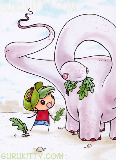
Supposed to list the colours used:
Rv0000
RV11
E00
r27
yg11
yg13
g40
g82
b21
b23
e02
rv91
E40
and some homemade colours as well.
If you'd like to see more of my artwork and the Comic Project visit my other blog Animated Guru
I sketched this out yesterday and decided to use it for the copic colour challenge on the Icopic Blog.
So it's little guru wooing albino dinosaurs.
thats what I do.
Supposed to list the colours used:
Rv0000
RV11
E00
r27
yg11
yg13
g40
g82
b21
b23
e02
rv91
E40
and some homemade colours as well.
If you'd like to see more of my artwork and the Comic Project visit my other blog Animated Guru
Subscribe to:
Posts (Atom)