I know a lot of new copic artists get discouraged when they first try out copic markers. They're very tricky to get the hang of and take an exceptional amount of skill to master (note: I said Skill, not talent. a misconception about art and artists is that everything comes naturally to them. It's simply not so. Frankly, its a little insulting to think so as well. I worked hard for years to get where I am, and so must everyone else.)
I wanted to compile a list of things I've learned over the years that may help new comers get over the hurdles that we all face, and carry on, instead of giving up. Here are the 5 things - 2 mental, 3 practical - that combined will do the one thing everyone needs to do - build confidence.
1: Don't get discouraged. It's not easy. Each and every tool you pick, and every medium you try out will take a lot of work to figure out how to use the tools. They don't magically look fantastic as soon as you start scribbling.
2: Experiment: Don't just dive into colouring a picture right away and expect magic. Play with the tools on scrap paper, colour randomly and just become familiar with how the ink flows from the nibs, reacts with the paper etc. Colour over other colours, see what happens, try different papers, try incorporating other tools. discover your rhythm.
3: Practice: Again, NOTHING in this life is ever easy. With practice, you gain skills and confidence. Its true what they say, Practice Makes Perfect (perfect doesn't exist by the way, but the theory is sound). Properly it should say " practice makes competence" but I digress... It's not like anyone is going to see the things you are doing unless you show them (good forgetting feedback!), why would you worry about the mistakes your making? You MUST make mistakes in order to learn. We don't usually learn from success. I've been using markers for around 12 years, and I've only in the last 2-3 years finally started having some confidence in my work! I'm my own worst critic of course, but I committed myself to learning and It's been paying off!
4: Research: The benefit of being a Copic artist, is the Copic community. There are a million blogs out there like mine, and a million artists like me who simple enjoy sharing what we've learned. Don't be afraid to ask any questions. some people will ignore you, who cares, ask someone else. I'll never ignore a Copic question :) The best places to look are the Copic Facebook page, The copic twitter, the copic blog, and youtube. (all these places are linked on copicmarker.com) The people who work at Copic are Top notch and I've so impressed with the people who work there - I'm quite fond of the Copic twitter guy, Richard! He's been incredibly supportive of so many artists out there. I think any company would be incredibly lucky to have someone like him at the front lines of their digital presence. You should also look up reference images of what you're colouring. Use a colour isolator to see individual colour in pictures or scenes and see what magical rainbows are hiding. Learn a little bit about colour theory. You don't have to become an expert but a little understanding can go a LONG way. Learn Everything!
5: Be Patient: Again, it takes time, practice, work, effort. Nothing in life is free. it either takes money, or commitment. the rewards are worth it. There is nothing more thrilling than being called an expert, HAHA!
There you go, 5 golden rules. Now I'm going to go off and keep learning and practicing myself!
Happy Copic-ing!

Showing posts with label research. Show all posts
Showing posts with label research. Show all posts
Sunday, 24 June 2012
Tuesday, 5 April 2011
Product Suggestions
So I've recently been feeling a little stifled by the range of materials Copic has (I know, Markers should be enough but I use so much more! and I'm into accessories) and sent in a couple product suggestions in to Copic for a couple of things, one was a type of brush for the ink, and one was an ink Palette.
So in thinking about what I was looking for in products like this, I got curious.. What would YOUR ideal Copic brush (not nib, but actual brush for painting with Copic ink) be like, and what would an ideal Copic ink palette look like to you? I have always mixed my colours on the surface of my desk. It's a slightly textured melamine surface and the ink doesn't spread too fast or creep much on it, making it easier to mix colours and stuff. (I also use it for palette blending).
Ya, I know what I'm looking for in these products but I'm curious about what you would look for. Have you even tried the inks? I highly recommend it if you haven't. You can use q-tips to paint with them (until they start manufacturing my suggestions LMAO). I've also used the colourless blender with a variety of paint brushes for some effects. pretty swanky!
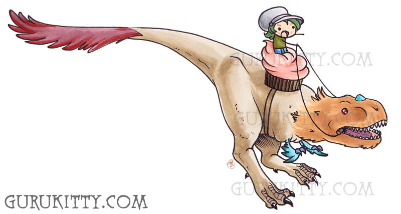
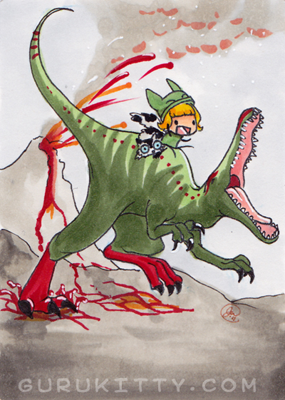
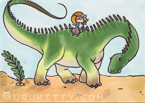
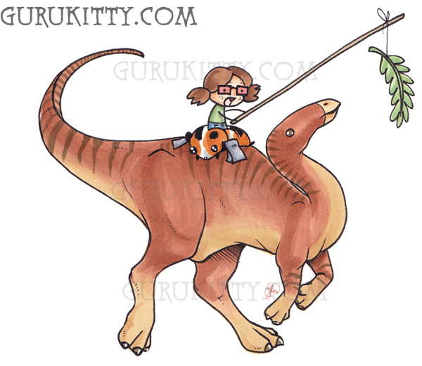
As a side note, for a limited time I have opened commissions for Copic Sketch cards of you/your character riding a dinosaur of your choice.
YOU HAVE UNTIL APRIL 10th to Order them!
Fill out THIS ORDER FORM to order a dinosaur riding commission! After you submit it I will send a paypal request for money to the address you provide me. Once I receive your payment, I'll work on your Dinosaur!
Because they're sketch cards I can add a simple Background like the examples in this blog post: [link]
please note! Sketch cards are 2.5"x3.5" small! there is a limited amount of detail that can be obtained in this! you can specify shirt colour and pants colour, IF I can get that it.
Each sketch card will cost $10!
Payment is due before I even start your card, and you must pay before the 10th of April. Any payment received after the 10th will be refunded and I will not do it!
So in thinking about what I was looking for in products like this, I got curious.. What would YOUR ideal Copic brush (not nib, but actual brush for painting with Copic ink) be like, and what would an ideal Copic ink palette look like to you? I have always mixed my colours on the surface of my desk. It's a slightly textured melamine surface and the ink doesn't spread too fast or creep much on it, making it easier to mix colours and stuff. (I also use it for palette blending).
Ya, I know what I'm looking for in these products but I'm curious about what you would look for. Have you even tried the inks? I highly recommend it if you haven't. You can use q-tips to paint with them (until they start manufacturing my suggestions LMAO). I've also used the colourless blender with a variety of paint brushes for some effects. pretty swanky!
As a side note, for a limited time I have opened commissions for Copic Sketch cards of you/your character riding a dinosaur of your choice.
YOU HAVE UNTIL APRIL 10th to Order them!
Fill out THIS ORDER FORM to order a dinosaur riding commission! After you submit it I will send a paypal request for money to the address you provide me. Once I receive your payment, I'll work on your Dinosaur!
Because they're sketch cards I can add a simple Background like the examples in this blog post: [link]
please note! Sketch cards are 2.5"x3.5" small! there is a limited amount of detail that can be obtained in this! you can specify shirt colour and pants colour, IF I can get that it.
Each sketch card will cost $10!
Payment is due before I even start your card, and you must pay before the 10th of April. Any payment received after the 10th will be refunded and I will not do it!
Here are some examples of the sketch cards:
Sunday, 27 June 2010
Planning an Illustration
So, With my most recent illustration I posted here I was tackling things I've never done with markers before.
I've done a few little sketch cards with a secondary light source, blue glows etc, but nothing on a larger scale. I also never coloured thunderstorms before. So instead of blindly throwing markers to paper and hoping for the best, I did a little pre planning.
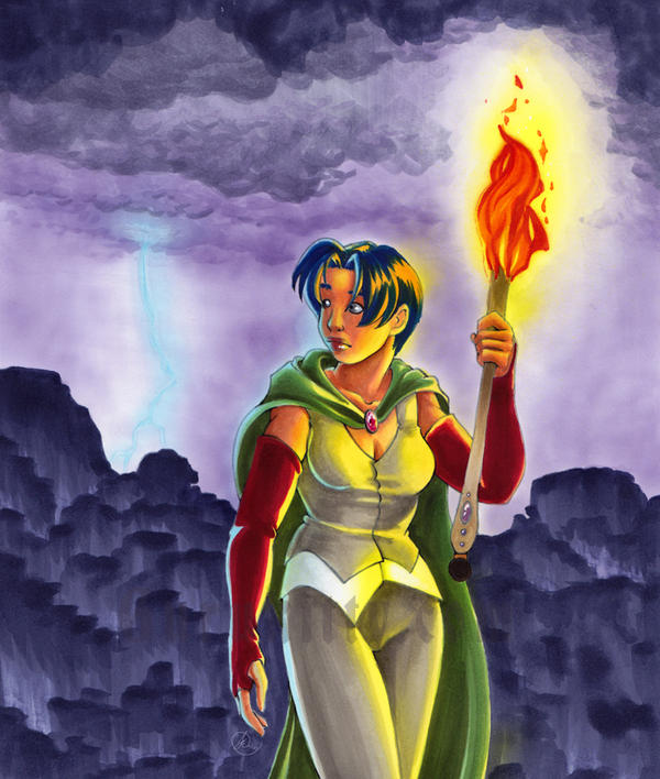
Step one for your illustration is research. I googled thunder storms, and lightning for hours before I did this. As I sketched, I'd take breaks to google, and see what sort of sky's came from lightning. In the end I wanted a nice violet sky, since I think I under use violets (hyuk hyuk... I use it in EVERY picture in some form), and it had the most appeal for me. I also searched around for fire, and looked at how fire light casts on skin etc. I made sure to give her skin a nice red brown tone to it, and the torch would be shadowed below her hand etc.
This research is even more important than the anatomy, or any other accuracy. These little details are what make your images believable.
 My sketch had the basic shading blocked in. This helps. I knew the torch would be the dominant light source, and the lighting would be to secondary light source.
So... my shading is pretty rough here too, but it was partially in my head as well. As you can see I also have notes about the colours I wanted the sky.
I also played around with the design of the fire. As an illustrator, you should take some time making sure your elements are somewhat stylized in some way. No, it doesn't look like real fire, but wouldn't that look silly with my cartoon woman?
My biggest pet peeve in the cartoon world is a huge beginner plague of throwing characters over top of a photo BG. That makes no sense to me.
Your environment should compliment your characters!
 Anyways, so after I had an idea of what I wanted, I needed to think about what colours I was going to use. It's always best to test colours and techniques on the same type of paper as your illustration! In this case I used Copic Pure white, and tested on a test page from my reference book.
The cliffs (yes, those are indeed cliffs. I know, epic fail at them but... I tried something new. Sue me) were initially going to be silhouetted but I couldn't stomach using black, and I didn't have any colours close to black, except one I made, that was a red black. Red would not have been fitting here. I had to make a new colour. I made one out of 10 parts BV04 and 1 part 100 (seen in the bottom of this testing page. I tried various ratios. I'll do a little article on mixing colours someday). This mix gave me a near black violet colour I really liked.
I also wanted do do some fantasy style cliffs, and tested the technique (bottom left corner) and thought it looked good. looked better smaller, that's for sure, LOL.
...Anyways, So ya, the other thing I wanted to pre-plan was the lighting from the torch, and to make sure that what was in my head could make it onto paper realistically. SO you see there, I inked 2 quick faces, and coloured them in a couple different ways. I discussed some of it with my sister as well and we decided that the skin and hair needed to have different yellows used to create the light on her. Y11 for her skin and Y17 for her hair.
I wrote down all the colours I used, in the order i used them. so when it came to making it onto paper i had no surprises.
I also made some tests of the blue lightning on the dark sky. Light colours push dark colours, but they all do it differently. I was testing which one would do it best.
So there you go, the wee bits of research that went into my illustration.
Hope someone finds this useful :)
Remember, Research is your friend.
I've done a few little sketch cards with a secondary light source, blue glows etc, but nothing on a larger scale. I also never coloured thunderstorms before. So instead of blindly throwing markers to paper and hoping for the best, I did a little pre planning.
Step one for your illustration is research. I googled thunder storms, and lightning for hours before I did this. As I sketched, I'd take breaks to google, and see what sort of sky's came from lightning. In the end I wanted a nice violet sky, since I think I under use violets (hyuk hyuk... I use it in EVERY picture in some form), and it had the most appeal for me. I also searched around for fire, and looked at how fire light casts on skin etc. I made sure to give her skin a nice red brown tone to it, and the torch would be shadowed below her hand etc.
This research is even more important than the anatomy, or any other accuracy. These little details are what make your images believable.

So... my shading is pretty rough here too, but it was partially in my head as well. As you can see I also have notes about the colours I wanted the sky.
I also played around with the design of the fire. As an illustrator, you should take some time making sure your elements are somewhat stylized in some way. No, it doesn't look like real fire, but wouldn't that look silly with my cartoon woman?
My biggest pet peeve in the cartoon world is a huge beginner plague of throwing characters over top of a photo BG. That makes no sense to me.
Your environment should compliment your characters!

The cliffs (yes, those are indeed cliffs. I know, epic fail at them but... I tried something new. Sue me) were initially going to be silhouetted but I couldn't stomach using black, and I didn't have any colours close to black, except one I made, that was a red black. Red would not have been fitting here. I had to make a new colour. I made one out of 10 parts BV04 and 1 part 100 (seen in the bottom of this testing page. I tried various ratios. I'll do a little article on mixing colours someday). This mix gave me a near black violet colour I really liked.
I also wanted do do some fantasy style cliffs, and tested the technique (bottom left corner) and thought it looked good. looked better smaller, that's for sure, LOL.
...Anyways, So ya, the other thing I wanted to pre-plan was the lighting from the torch, and to make sure that what was in my head could make it onto paper realistically. SO you see there, I inked 2 quick faces, and coloured them in a couple different ways. I discussed some of it with my sister as well and we decided that the skin and hair needed to have different yellows used to create the light on her. Y11 for her skin and Y17 for her hair.
I wrote down all the colours I used, in the order i used them. so when it came to making it onto paper i had no surprises.
I also made some tests of the blue lightning on the dark sky. Light colours push dark colours, but they all do it differently. I was testing which one would do it best.
So there you go, the wee bits of research that went into my illustration.
Hope someone finds this useful :)
Remember, Research is your friend.
Subscribe to:
Posts (Atom)