
I've done a few little sketch cards with a secondary light source, blue glows etc, but nothing on a larger scale. I also never coloured thunderstorms before. So instead of blindly throwing markers to paper and hoping for the best, I did a little pre planning.
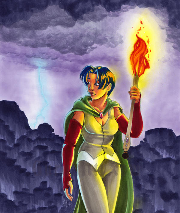
Step one for your illustration is research. I googled thunder storms, and lightning for hours before I did this. As I sketched, I'd take breaks to google, and see what sort of sky's came from lightning. In the end I wanted a nice violet sky, since I think I under use violets (hyuk hyuk... I use it in EVERY picture in some form), and it had the most appeal for me. I also searched around for fire, and looked at how fire light casts on skin etc. I made sure to give her skin a nice red brown tone to it, and the torch would be shadowed below her hand etc.
This research is even more important than the anatomy, or any other accuracy. These little details are what make your images believable.

So... my shading is pretty rough here too, but it was partially in my head as well. As you can see I also have notes about the colours I wanted the sky.
I also played around with the design of the fire. As an illustrator, you should take some time making sure your elements are somewhat stylized in some way. No, it doesn't look like real fire, but wouldn't that look silly with my cartoon woman?
My biggest pet peeve in the cartoon world is a huge beginner plague of throwing characters over top of a photo BG. That makes no sense to me.
Your environment should compliment your characters!

The cliffs (yes, those are indeed cliffs. I know, epic fail at them but... I tried something new. Sue me) were initially going to be silhouetted but I couldn't stomach using black, and I didn't have any colours close to black, except one I made, that was a red black. Red would not have been fitting here. I had to make a new colour. I made one out of 10 parts BV04 and 1 part 100 (seen in the bottom of this testing page. I tried various ratios. I'll do a little article on mixing colours someday). This mix gave me a near black violet colour I really liked.
I also wanted do do some fantasy style cliffs, and tested the technique (bottom left corner) and thought it looked good. looked better smaller, that's for sure, LOL.
...Anyways, So ya, the other thing I wanted to pre-plan was the lighting from the torch, and to make sure that what was in my head could make it onto paper realistically. SO you see there, I inked 2 quick faces, and coloured them in a couple different ways. I discussed some of it with my sister as well and we decided that the skin and hair needed to have different yellows used to create the light on her. Y11 for her skin and Y17 for her hair.
I wrote down all the colours I used, in the order i used them. so when it came to making it onto paper i had no surprises.
I also made some tests of the blue lightning on the dark sky. Light colours push dark colours, but they all do it differently. I was testing which one would do it best.
So there you go, the wee bits of research that went into my illustration.
Hope someone finds this useful :)
Remember, Research is your friend.
Hey Guru,
ReplyDeleteI changed the official rules of the iCopic challenge so be sure to come play along :O) It is officially in the rules now that anything Copic goes.
Hugs,
Samantha